Working on my personal website: Part 1
So it’s been a while since I gave some love to my website. I started by returning my domain to my original provider (It’s been 1&1 for ages, no time to change it) to be able to host the website there (hosting is free and already attached to the domain morettigiuseppe.com so, easier to leave it like that).
This worked ok and I took adventage of the opportunity to put a custom domain to my blog with a CNAME record into the blog subdomain.
Cool, so before I start doing any redesign I would like to automate the deployment on push to the master branch of my GitHub project. This is now extremely easy with GitHub Actions.
My domain/hosting can be accessed to deploy files via SFTP, so all I need is a github action that does this. My workflow looks like this now:
on: push
name: Deploy SFTP
jobs:
  FTP-Deploy-Action:
    name: FTP-Deploy-Action
    runs-on: ubuntu-latest
    steps:
    - uses: actions/checkout@master

    - name: FTP-Deploy-Action
      uses: SamKirkland/FTP-Deploy-Action@2.0.0
      env:
        FTP_SERVER: $
        FTP_USERNAME: $
        FTP_PASSWORD: $
        METHOD: sftp
        PORT: 22
        ARGS: --delete --exclude-glob=logs/*
Configured a couple of GitHub secrets on settings for login and all set!.
more tweaks
I still would like to have the same minimalistic approach with just a few improvements.
favicon, change font type and links
There were simple details that I had not done in the rush of creatining it the first time. I had no favicon so I used a generator to get one, simple.
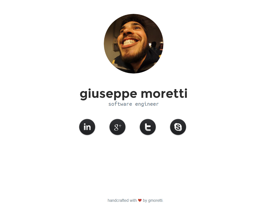
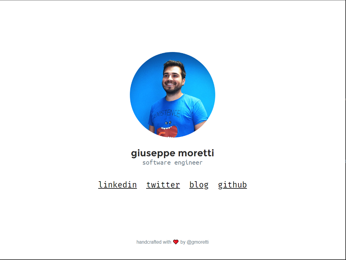
Another thing I wanted to get rid of were the image links, I wanted to give a more geeky look so changing to a monospace font did the trick, also, it looks more like the dev.to’s style which is really cool. Also, I modified some css classes to display properly the links and use the whole screen.
Since I was here, I also changed the image.
adapt de mobile view
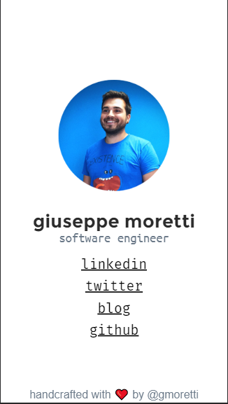
So I use media queries as explained in this post the idea is to have a the basic mobile layout and then use the media queries to identify the device and put the exceptions, in my case was pretty simple. I wanted to have, in case of mobile, bigger image, bigger text and the list of links should be vertical instead. So the effect is that in mobile it looks more like a card and the links are easier to click.
<link rel="stylesheet" type="text/css" href="css/style.css" media="screen, handheld" />
<link rel="stylesheet" type="text/css" href="css/style-desktop.css" media="screen  and (min-width: 70em)" />
The second link with the desktop css rules will be called only if the screen is bigger than 70em. Keep in mind that they are not exclusive so in case the screen is big both files will be called and like always in css, last rule applies so the desktop file will replace any existen rules, This is why in this file si where we put only the things we want to override.
@media screen and (min-width: 70.5em) {
  #mainTitle{
    font-size: 2em;
  }

  .subtitle{
    font-size: 1.5em;
  }

  #profile{
    width: 18em
  }

  .socialNetworkLink{
    display: inline;
    font-size: 1.7em;
  }

  .love{
    font-size: 1.0em;
  }
}
Then the overrides are only changing sizes and the way the links are displayed.
I also changed the footer like the first one explained in this link to get the effect of the footer being always at the bottom but if the website scrolls, that the footer scrolls too. This is very well explained on the link
[Añadir foto antes despues usango el git para sacar las fotos] [añadir el link al repo, quzas al dif entre los dos estados]
before and after


next steps
I would like to have an area to list tiny project or things that I have made. Like a portfolio of some sort. Also I think it coould be cool to have a selector in the corner that could switch between development stuff and music stuff. Maybe it could change to negative colors (black background) and change the links and the projects.